In slow burn romance anime, visual storytelling is just as crucial as narrative pacing. Different studios bring distinct artistic approaches that shape how romantic tension builds through cinematography, color palettes, and animation techniques. Here’s how the industry’s top studios craft their romantic masterpieces, each with signature styles that enhance the slow burn experience.
Studio Style Overview
| Studio | Signature Style | Romantic Focus | Best Example |
| Production I.G | Watercolor softness, delicate character animation | Pure-hearted innocence | Kimi ni Todoke |
| J.C.Staff | Dynamic lighting shifts, emotional color contrast | Dramatic character arcs | Toradora! |
| TMS Entertainment | Healing color progression, psychological depth | Transformative relationships | Fruits Basket |
| Imagin | Rich orchestral integration, dialogue-heavy scenes | Intellectual chemistry | Spice and Wolf |
| SynergySP | Seasonal metaphors, nostalgic atmosphere | Bittersweet growth | Cross Game |
Production I.G: The Watercolor Romance Masters
Visual Philosophy: Soft, dreamlike aesthetics that mirror gentle emotional progression
Color Approach: Muted pastels with warm highlights during intimate moments
Animation Style: Delicate character movements emphasizing subtle expressions
Kimi ni Todoke (2009) — The Gold Standard
Studio Strengths: Production I.G excels at creating cozy, heartwarming atmospheres through their signature watercolor backgrounds. Their delicate character animation perfectly captures the glacially paced emotional development between pure-hearted leads who take 25 episodes just to hold hands.
Scene Highlight: School festival classroom scene (S1E12, 18:32) where Sawako’s first real smile at Kazehaya demonstrates how subtle facial animation can convey profound emotional breakthroughs.
Why This Style Works: The soft visual approach prevents viewers from becoming impatient with the slow pacing, creating a meditative viewing experience that matches the characters’ gentle personalities.
Fan Response: “The art style made me feel like I was watching a living painting unfold”
J.C.Staff: Masters of Emotional Lighting
Visual Philosophy: Dynamic cinematography that reflects internal character states
Color Approach: Stark contrasts between warm oranges (tender moments) and harsh blues (conflict)
Animation Style: Expressive character reactions with emphasis on emotional beats
Toradora! (2008) — The Emotional Rollercoaster
Studio Strengths: J.C.Staff’s mastery of lighting shifts creates visual metaphors for character mood changes. Their animation excels during high-emotion scenes, making tsundere personalities feel authentic rather than archetypal.

Scene Highlight: Christmas Eve confession breakdown (E19, 21:45) where harsh winter lighting gradually softens to warm indoor tones, visually representing Taiga’s emotional vulnerability.
Why This Style Works: The dramatic visual approach amplifies the enemies-to-lovers tension, making every small romantic progression feel like a major victory against the odds.
Fan Response: “The lighting in this show basically told the story by itself”
TMS Entertainment: The Healing Aesthetic
Visual Philosophy: Color as emotional therapy and character growth visualization
Color Approach: Progression from muted grays to vibrant hues representing healing
Animation Style: Detailed facial expressions focusing on psychological nuance
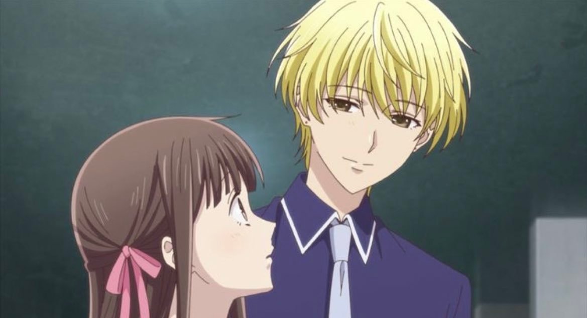
Fruits Basket (2019) — The Transformative Journey
Studio Strengths: TMS Entertainment’s color palette evolution becomes a character in itself. Their 63-episode commitment allows for the most gradual visual transformation in anime, with colors literally healing as characters do.
Scene Highlight: Yuki’s rooftop speech (Final S3E8, 19:30) where the background shifts from stormy grays to gentle sunset oranges, visualizing his emotional breakthrough about self-love.
Why This Style Works: The healing aesthetic makes viewers feel they’re participating in therapy alongside the characters, creating deeper emotional investment in relationship outcomes.
Fan Response: “Watching the colors literally come back into their world made me cry”
Imagin: The Intellectual Romance Studio
Visual Philosophy: Dialogue-driven scenes supported by rich atmospheric detail
Color Approach: Medieval warmth with candlelit intimacy during crucial conversations
Animation Style: Subtle character interactions emphasizing verbal chemistry
Spice and Wolf (2008) — The Sophisticated Courtship
Studio Strengths: Imagin transforms economics discussions into romantic foreplay through careful attention to dialogue delivery and intimate scene composition. Their rich orchestral integration emphasizes the intellectual chess match between merchant and wolf deity.
Scene Highlight: Inn room confession (S1E6, 16:20) where candlelight flickers across faces during Holo’s vulnerable moment about loneliness, proving that dialogue can be as visually striking as action.
Why This Style Works: The sophisticated approach attracts viewers who prefer cerebral romance over physical attraction, making intellectual compatibility feel genuinely romantic.
Fan Response: “Their conversations felt more intimate than most anime kiss scenes”
SynergySP: The Nostalgic Storytellers
Visual Philosophy: Sports metaphors woven seamlessly into romantic development
Color Approach: Seasonal changes marking emotional growth and time passage
Animation Style: Baseball integration with natural character interactions
Cross Game (2009) — The Bittersweet Marathon
Studio Strengths: SynergySP uses baseball as a romantic metaphor across 50 episodes, with seasonal changes providing visual cues for emotional development. Their nostalgic atmosphere creates bittersweet viewing experiences.
Scene Highlight: Baseball diamond sunset (E25, 20:15) where Ko finally says Aoba’s name properly, using sports achievement to symbolize romantic progress.
Why This Style Works: The sports backdrop provides natural pacing that prevents relationship development from feeling forced, allowing romance to grow organically alongside character skills.
Fan Response: “The baseball wasn’t just background—it was their love language”
Studio Comparison: Technical Approaches
Animation Quality Focus
- Production I.G: Facial micro-expressions and gentle body language
- J.C.Staff: Dynamic reaction shots and emotional outbursts
- TMS Entertainment: Consistent character model evolution over time
- Imagin: Dialogue delivery and conversational chemistry
- SynergySP: Sports action integration with romantic beats
Color Psychology Application
- Production I.G: Soft pastels creating safe emotional spaces
- J.C.Staff: High contrast representing internal conflict
- TMS Entertainment: Healing progression through color saturation
- Imagin: Warm medieval tones suggesting intimacy
- SynergySP: Seasonal colors marking relationship phases
Pacing Philosophy
- Production I.G: Meditative, allowing viewers to appreciate small moments
- J.C.Staff: Dramatic peaks and valleys creating emotional investment
- TMS Entertainment: Therapeutic, emphasizing character healing
- Imagin: Intellectual, prioritizing dialogue over visual spectacle
- SynergySP: Natural, using external activities to pace romance
How Studio Choice Affects Viewing Experience
For Patience-Challenged Viewers
Best Studios: J.C.Staff and SynergySP provide external drama and sports action that maintain engagement during slower romantic moments.
For Atmosphere Lovers
Best Studios: Production I.G and TMS Entertainment create immersive visual experiences that make slow pacing feel intentional rather than sluggish.
For Dialogue Fans
Best Studios: Imagin excels at making conversations feel cinematic and romantically charged through careful scene composition.
Studio Evolution in Romance Animation
Modern slow burn romance studios have moved beyond simple character interaction toward psychological visual storytelling. Each studio has developed signature approaches that enhance narrative themes:
- Visual therapy (TMS Entertainment) uses color progression to show healing
- Emotional lighting (J.C.Staff) reflects character internal states
- Atmospheric immersion (Production I.G) creates meditative viewing experiences
- Intellectual cinematography (Imagin) makes dialogue visually compelling
- Metaphorical integration (SynergySP) weaves activities into romantic development
Choosing Your Studio Style
If you prefer gentle, cozy romance: Production I.G’s watercolor approach
If you want emotional intensity: J.C.Staff’s dramatic lighting
If you need character healing themes: TMS Entertainment’s color therapy
If you enjoy intellectual chemistry: Imagin’s dialogue-focused scenes
If you like activity-based romance: SynergySP’s sports integration
The Psychology of Studio Style Impact
Different visual approaches trigger distinct emotional responses in viewers. Production I.G’s soft aesthetics reduce impatience with slow pacing, while J.C.Staff’s dramatic contrasts amplify emotional investment. TMS Entertainment’s healing colors create therapeutic viewing experiences, and Imagin’s intimate scene composition makes dialogue feel romantically charged.
Studio choice significantly impacts how viewers experience slow burn romance, with visual style either enhancing or hindering patience for gradual relationship development. The most successful slow burns match studio strengths with narrative themes, creating cohesive viewing experiences where art and story reinforce each other.
What fans are saying:
- “The art style completely changed how I felt about the pacing”
- “I never realized how much the animation affected my patience level”
- “Each studio has its own romance language through visuals”
Methodology
This analysis examines studio-specific visual techniques across major slow burn romance anime, focusing on how different artistic approaches impact viewer emotional engagement. We analyzed color usage, animation priorities, and cinematographic choices that distinguish each studio’s romantic storytelling philosophy. Selection criteria emphasized consistent visual themes across multiple romantic works rather than single-series achievements.